Color Analysis Seasons Explained: Which Season Are You?

Beyond Undertone - How color analysis seasons add depth and contrast to the equation
When most people talk about color analysis, they stop at undertone: “I’m warm” or “I’m cool.” That’s a helpful starting point, but it’s a blunt tool. In my analysis work, the colors that truly transform someone rarely come from undertone alone; they come from the interplay of undertone, depth, and contrast. When those three align, skin looks smoother, eyes sharpen, and your outfit feels expensive without trying.
Here’s how I think about it:
- Undertone: the temperature of your skin (cool, warm, or neutral-leaning).
- Depth: how light or dark your overall coloring appears.
- Contrast: the difference between your features (for example, hair vs skin, eyes vs hair).
Two people can share a warm undertone and still need completely different palettes because their depth and contrast are opposite. One might glow in light, juicy corals; the other needs rich, earthy terracotta to avoid looking flat. Seasonal color analysis takes those nuances and turns them into repeatable rules so you stop guessing every time you see a new dress online.
This matters for your day-to-day life. When you know your seasonal direction, you move faster: you scroll past the colors that will drain you and zero in on what works. That means fewer cart experiments, fewer mirror meltdowns, and more outfits that feel aligned with who you are. Undertone is the doorway, but seasons give you the actual floor plan.

The 12 Seasons Framework - Spring, Summer, Autumn, Winter + their sub-seasons
Classic seasonal color analysis starts with four main groups: Spring, Summer, Autumn, and Winter. The modern 12-season system refines this by adding sub-seasons that describe how light vs deep, soft vs bright, and warm vs cool you are within that main family. That extra precision is what makes a palette feel like it was made for you, not just most people with your undertone.
Here’s the structure I use:
- Spring (warm + bright): Light Spring, True/Warm Spring, Bright/Clear Spring.
- Summer (cool + soft): Light Summer, True/Cool Summer, Soft Summer.
- Autumn (warm + muted): Soft Autumn, True/Warm Autumn, Deep Autumn.
- Winter (cool + deep): Deep Winter, True/Cool Winter, Bright/Clear Winter.
Each sub-season adjusts three sliders: hue (warm/cool), value (light/deep), and chroma (soft/gray vs bright/clear). For example, a Light Spring and a Bright Spring both sit in the warm, spring quadrant, but Light Spring needs gentle, airy shades while Bright Spring thrives in saturated, clean color. This is why one person looks polished in pastel mint while their friend needs sharp emerald to avoid looking faded.
When you land in the right sub-season, shopping becomes more strategic. You understand why a particular lipstick that “should” suit you still looks off, or why black feels heavy but charcoal feels refined. You can filter choices quickly by asking: Is this my warmth, my depth, and my clarity level? That’s the kind of framework that cuts returns, tightens your wardrobe color story, and makes getting dressed almost automatic.

Spring (Warm + Bright) - Characteristics, best colors, styling approach
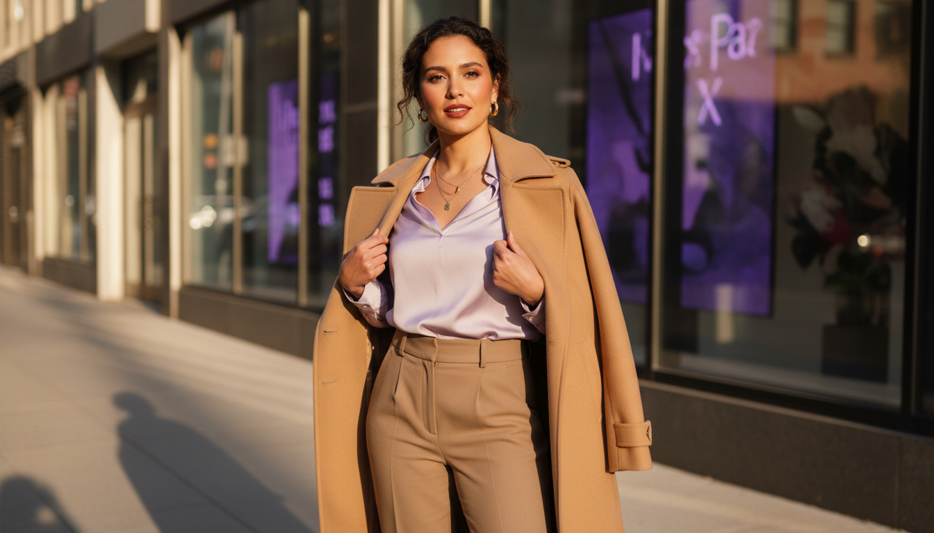
If you’re a Spring, your coloring reads light, warm, and lively. I often see clear eyes (blue, green, light hazel), warm-blond to light brown hair, and skin that feels peachy, golden, or neutral-warm. The overall effect is fresh and energetic, not heavy or dramatic. When I drape Springs, dull or ashy colors instantly make the face look tired, while bright, warm hues make the skin look lit from within.
Your best colors are warm, clear, and often light to medium in depth:
- Juicy corals, warm peaches, and apricot.
- Golden yellows, warm turquoise, seafoam, and mint.
- Warm pinks, clear tomato red, and light camel or warm beige.
In outfits, I like to keep Springs in clean, crisp color stories with limited muddiness. Think cream trousers with a coral knit and soft gold jewelry, or a light denim jacket over a warm aqua tee. Neutrals should stay warm and relatively light: ivory, light camel, warm navy rather than stark black or cool gray. Black, deep burgundy, and dusty taupe usually feel too harsh or murky here.
Styling-wise, lean into brightness and movement. Light fabrics, a bit of shine, and playful details reflect your natural energy. From a ROI perspective, once a Spring edits out the grays, harsh blacks, and muddy olives, their wardrobe suddenly coordinates; tops mix and match more easily, makeup takes fewer tries, and online orders are less of a gamble because you know which color codes to skip immediately.
Summer (Cool + Soft) - Characteristics, best colors, styling approach
Summer coloring looks cool, gentle, and refined. I often see ash-blond to soft brown hair, gray-blue or soft hazel eyes, and skin that leans cool or neutral with a delicate, slightly muted quality. The overall impression is diffused rather than high-contrast. When I test colors, sharp primaries overpower Summers, but soft, cool shades make their eyes look quietly luminous.
Your best colors are cool, soft, and slightly grayed:
- Blue-based pinks, mauves, and rose.
- Powder blue, slate blue, soft navy, and lavender.
- Cool taupe, mushroom, dove gray, and soft charcoal.
On you, I like to build palettes that feel like overcast light: no harsh edges, just layered cool tones. A dusty rose blouse, gray trousers, and silver jewelry, for example, will usually flatter more than stark white with jet black. Pure black, clear orange, and warm camel often look loud or off against Summer skin, making features recede instead of glow.
Styling approach: think soft structure and gentle contrast. You still can wear color; it just works better when it’s brushed, powdery, or heathered rather than neon or primary. This is the season where subtlety pays off: you save time by filtering out overly bright pieces and reaching for items that have that “smoky” coolness. As your closet shifts toward coherent, cool-soft tones, outfits start working together naturally, and you stop buying random warm items that only match themselves.
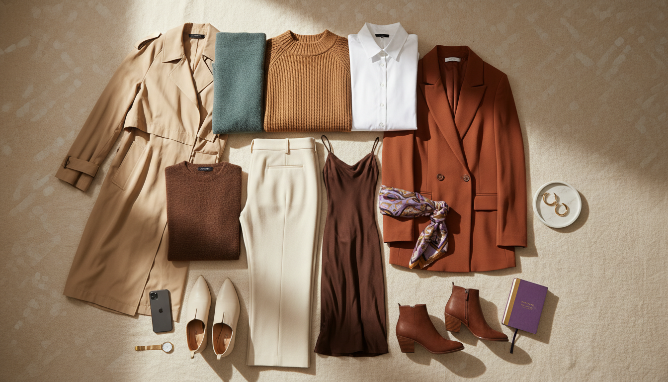
Autumn (Warm + Muted) - Characteristics, best colors, styling approach
Autumn coloring feels warm, grounded, and rich. I often see medium to dark hair with golden or red undertones, green, warm brown, or amber eyes, and skin that reads golden, olive, or bronze. The overall impression is earthy and dimensional rather than bright or icy. When I drape Autumns in cool, icy shades, their skin looks sallow; in warm, muted tones, everything suddenly looks harmonious.
Your best colors are warm, muted, and medium to deep:
- Burnt orange, rust, terracotta, and warm brick.
- Olive, moss, warm forest green, and golden khaki.
- Mustard, camel, toffee, chocolate brown, and warm navy.
In outfits, I like to aim for layered, natural color stories, almost like a forest in late afternoon. A moss green blazer with a cream top and cognac boots will usually beat stark black and white for you. Icy pastels, pure white, and sharp, clear jewel tones often look disconnected on Autumns, as if the clothes are wearing you.
Styling-wise, texture works hard for you: suede, knits, brushed metals, and natural fibers echo your palette’s depth. ROI-wise, once Autumns commit to warm, muted tones for both clothing and accessories, everything starts mixing and matching: your bag works with most shoes, lip colors sit comfortably against your skin, and you stop buying cool-toned basics that never quite feel right in the mirror.
Winter (Cool + Deep) - Characteristics, best colors, styling approach
Winter coloring reads cool, high-contrast, and dramatic. I often see very dark hair paired with light or cool skin, or deep skin with strikingly bright eyes or whites of the eyes. The overall effect is crisp and intense. When I test colors on Winters, soft, dusty shades look sleepy, while bold, cool jewel tones snap their features into focus.
Your best colors are cool, clear, and often deep:
- True black, pure white, ink navy, and charcoal.
- Emerald, sapphire, royal blue, and fuchsia.
- Cool, clear red, magenta, icy pink, and icy pastels with a bright edge.
On you, strong contrast is your friend. Black and white stripes, a sharp red lip, or a cobalt blazer rarely overpower your features; they match your natural presence. Warm browns, beige, and muted earth tones usually look disconnected, as if the color belongs on someone else’s face.
For styling, I like to create intentional, graphic combinations. Clean lines, polished fabrics, and a bit of shine all support your palette. In practical terms, embracing your Winter palette means you can confidently buy black outerwear, cool-toned accessories, and bold lip colors knowing they’ll work together. That cuts decision time in half and keeps you from diluting your wardrobe with warm, muddy pieces you only wear once.
How to Determine Your Season - Quick diagnostic questions
You don’t need a full in-person draping to get a strong hypothesis about your season. I always start with targeted questions, then confirm with photos and color tests. Think of this as a fast filter that narrows the field from “millions of colors” to “the right quadrant” so your experiments become smarter, not random.
Start with temperature:
- Do you look healthier in tomato red or blue-red lipstick?
- Does gold jewelry feel natural while silver looks sharp (or vice versa)?
Then check value and contrast:
- Does very dark hair against light skin feel like your default, or do you read more low-contrast, with similar hair-skin-eye values?
- Do light, airy colors wash you out, or do dark, heavy colors overpower you?
Finally, test clarity vs softness:
- Do crisp, vivid colors make you look awake, or do they wear you?
- Do you feel more “like yourself” in smoky, gray-based tones or in clean, bright shades?
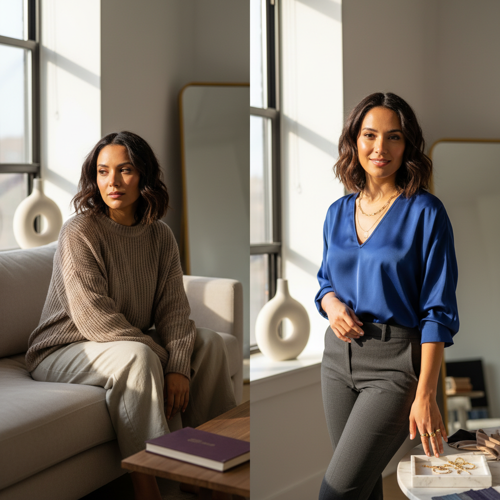
If you land on warm + bright, you’re likely in Spring; cool + soft points toward Summer; warm + muted leans Autumn; cool + deep suggests Winter. This isn’t about perfection; it’s about getting close enough that your next few purchases use the right palette as a filter. Once you see side-by-side photos of yourself in aligned vs misaligned colors, the pattern becomes obvious and your style decisions speed up dramatically.

Once you understand how seasons, contrast, and depth work on you, the next step is seeing your exact palette mapped onto your real face and wardrobe in seconds.
Let AI determine your exact color season
Mira analyzes your natural coloring and shows you which colors from your season will elevate every outfit—no expensive color analysis session required.
Practical Application - Shopping with your season in mind
Knowing your season only matters if it changes how you shop. I treat it as a pre-filter for every cart, every scroll, and every “Should I keep this?” moment. When you start there, you protect your time, your budget, and your closet space.
Here’s how to use your season immediately:
- Pre-filter by color family: if you’re a Summer, skip warm camels and bright oranges on sight.
- Scan product photos for undertone: look at how the color sits next to white or black to judge whether it’s warm, cool, bright, or muted.
- Commit to seasonal neutrals first: build a base of 3–4 neutrals from your palette (for example, ivory, camel, warm navy for Springs; charcoal, soft navy, cool taupe for Summers).
When those neutrals are consistent, your wardrobe starts to “snap” together. Tops and bottoms pair more easily, shoes work across outfits, and you need fewer statement pieces to feel styled. You also return less, because you’re no longer buying that random, trendy color that only works with one pair of jeans.
In-store, do quick mirror tests: hold the garment right under your face, then swap it for a color you know is in your palette. If your features look clearer, skin more even, and under-eye shadows softer in one, that’s your direction. Over time, you’ll recognize your best shades almost instinctively, and shopping shifts from guesswork to targeted curation.

Let AI determine your exact color season
Mira analyzes your natural coloring and shows you which colors from your season will elevate every outfit—no expensive color analysis session required.