Why You Look Washed Out (And How to Fix It)
The Problem - Looking tired, pale, or sickly despite feeling great
I see this pattern constantly: you feel rested, your skincare is cooperating, but the mirror insists on a different story. Your face looks dull, shadows under your eyes seem harsher, and people keep asking if you’re tired or feeling okay. When that happens, the issue is often not your face at all. It’s the color sitting right under your chin, bouncing light back onto your skin.
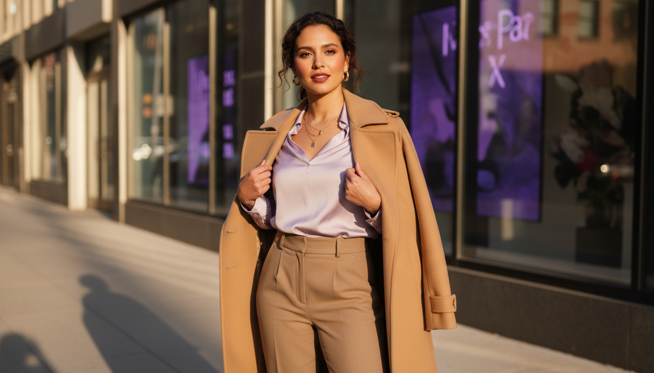
Think of your clothes as a filter on your features. The wrong filter pulls all the warmth or clarity out of your complexion, so your lips, eyes, and natural flush fade into the background. The right filter sharpens everything: your eyes look clearer, your skin looks smoother, and you look like you slept an extra two hours. This is why a simple T‑shirt swap can make a bigger difference than another concealer.
When you understand how undertone, contrast, and color intensity work together, getting dressed becomes faster and calmer. Instead of trying four tops before work, you can reach for a handful of reliable shades that always make you look alive. Fewer outfit changes, fewer returns, and less second‑guessing at checkout: that’s the real payoff of getting color right. Your wardrobe starts working for you, not against you.
Culprit #1: Wrong Undertone Colors - How pastels can drain cool undertones, etc.
Your skin has an undertone that doesn’t change, even when you tan or lose color in winter. It leans cool, warm, or neutral, and your best colors echo that temperature. When a color fights your undertone, it doesn’t just “clash.” It cancels out the natural color in your face so you look washed out. That’s why certain “nice” shades make you look oddly tired.
Here’s a simple way I frame it: cool undertones need clarity, warm undertones need warmth, and neutral undertones need balance. If you’re cool and someone puts you in dusty peach, beige, or yellow‑based camel, the yellow in those shades will exaggerate redness and dull your natural glow. On the flip side, if you’re warm and live in icy lilac, bluish pink, and stark black, your skin can look flat or slightly gray. Pastels are particularly treacherous when the undertone is off, because they’re already low‑energy; one wrong temperature and they turn you ghostly.
A quick check when shopping online: pause on any color that makes your skin in the product photo look more sallow, ruddy, or gray in your imagination. Ask yourself:
- Does this color feel more blue‑based (cool) or yellow‑based (warm)?
- Does my skin usually look better with silver jewelry (cool) or gold (warm)?
- Would I want my lipstick in this exact shade, or would it drain me?
Matching undertone doesn’t require a full seasonal analysis. It’s about noticing which colors make your lips, eyes, and natural flush stand out without makeup. Once you lock that in, you’ll stop buying “almost right” shades that live in your closet and never see daylight.

Culprit #2: Low Contrast - Why monochrome doesn’t work for everyone
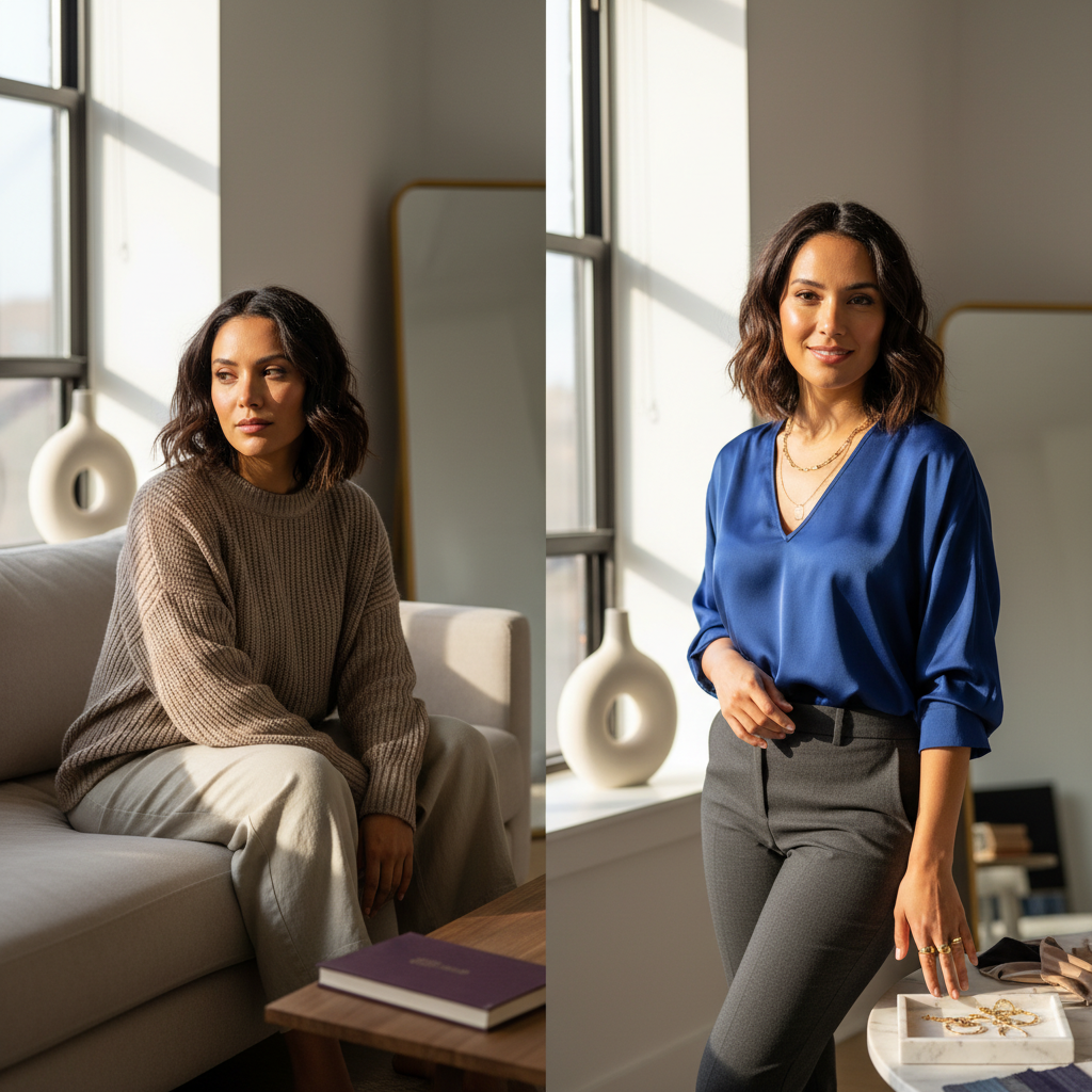
Contrast is the difference in lightness and depth between your features and your coloring as a whole. Some people have naturally high contrast: dark hair, light skin, strong brows. Others are inherently low contrast: similar hair, skin, and eye value, often in softer shades. Your best outfits echo your natural contrast level. When they don’t, your face can vanish.
Monochrome can be chic, but it’s not automatically flattering. If you have dark hair, distinct brows, and clear eyes, an all‑beige or all‑pale gray look from head to toe can erase your presence. Your features are asking to be framed by at least a medium level of contrast. On the other hand, if your coloring is very soft and blended, wearing harsh black‑and‑white stripes near your face can overwhelm your expression and make you look stern or drained.
Here’s a simple framework I use:
- High‑contrast faces (strong dark/light difference): need at least medium contrast in outfits.
- Medium‑contrast faces: flexible, can play with both, but should avoid extremes.
- Low‑contrast faces (soft, blended coloring): look best in gentle, tonal contrast.
Look at a selfie in grayscale to judge your natural contrast quickly. Then, compare it to your favorite outfits. You’ll usually find that the pieces that make you look most awake echo that same contrast level. Understanding this means fewer “mystery fails” where everything about the outfit seems right, yet something feels off when you see yourself on camera.

Culprit #3: Overly Muted Tones - When “neutrals” make you disappear
Muted colors are softened with gray or brown, which can be beautiful and sophisticated. The problem appears when your entire wardrobe lives in muted land while your features are naturally clear or high‑energy. In that case, soft taupe, greige, and dusty mauve make you look like you are fading out of your own outfit. Your eyes lose sparkle, your lips blend into your skin, and you start to look vaguely unwell.
Most “safe” colors sold as everyday basics are actually quite muted. Think oatmeal knits, stone chinos, dusty rose sweaters, and sage hoodies. If your complexion is bright, deep, or high‑contrast, stacking too many of these together near your face flattens your presence. You don’t look intentional; you look like part of the background. Conversely, if you are very soft and muted naturally, hyper‑saturated neons can steal attention away from your features and make your skin look uneven.
I like to sort color into three buckets for clients:
- Muted: lots of gray or brown added; looks soft and gentle.
- Medium clarity: everyday brights like true red, cobalt, emerald.
- High intensity: neons and very vivid shades.
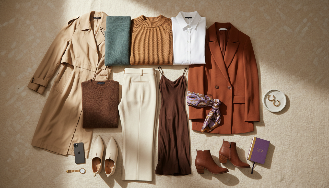
Your goal is to choose basics in the bucket that matches your natural clarity, especially for tops and scarves. Once you do, you stop over‑buying “neutral” pieces that technically go with everything, yet never do you any favors on Zoom. That alone cuts down on wasted purchases and gives you a smaller, sharper stack of go‑to items.
The Contrast Fix - Adding strategic contrast near your face
When contrast is off, you don’t need a whole new wardrobe. You need smarter placement. The most efficient move is to manage contrast right around your face: your neckline, your shoulders, and any piece that visually frames your head. A single well‑chosen layer or accessory here does more work than swapping an entire outfit.
Start by identifying your natural contrast level using the grayscale selfie test. Then, aim to mirror that level in three main spots:
- The top you wear closest to your face (tee, blouse, knit).
- The neckline or collar detail (piping, lapels, buttons).
- One accessory: earrings, a necklace, or a scarf.
If you’re naturally high contrast and wearing a soft beige sweater, add a darker jacket, a bold earring, or a deeper lip color to create a stronger frame. If you’re low contrast and stuck in a stark black top, soften it with a lighter cardigan, a nude‑leaning lip, or earrings that blend gently with your hair and skin. The goal is not drama for drama’s sake; it’s alignment. You want the outfit’s light/dark story to match the story your face is already telling.
Once you start styling this way, you’ll notice you can keep buying fewer pieces but make more of them work. Instead of chasing entirely new aesthetics, you adjust the contrast dial with a handful of supporting items. That saves you time every morning and reduces the urge to panic‑shop because “nothing looks right.” The contrast fix is about control, not quantity.

The Color Intensity Fix - Choosing the right saturation level
Color intensity is about how clean or vivid a shade appears, not just how light or dark it is. Two sweaters can both be green, but one is a soft sage and the other a sharp emerald. If your features are naturally bright and defined, wearing only soft, dusty tones can mute you. If your features are subtle and blended, hyper‑saturated pieces can shout over your face.
I like to anchor intensity to your eyes. If your eyes are clear and striking (deep brown, bright blue, emerald, amber), you can handle and often need medium to high‑intensity colors near your face. Think true red, cobalt, rich teal, clean fuchsia. If your eyes are softer (hazel with gold, gray‑green, light brown), you usually look best in medium‑soft tones: clay, rose, moss, muted teal, and softened navy.
Here’s a practical way to check saturation when you shop:
- Zoom in and ask, “Would this color upstage my eyes or support them?”
- If it feels louder than your features, go one notch softer.
- If it feels dull compared to your eyes, go one notch brighter.
The return on adjusting intensity is huge. A single T‑shirt in your ideal saturation can make you look more awake than a complex makeup routine. It also turns online shopping into a faster, more focused process. You scroll past entire color families that don’t serve you and invest in a small set of shades that always deliver impact without effort.
If you want this to feel effortless every morning, you can let my AI do the color math for you while you focus on living your life.
Never look washed out again
Mira's AI analyzes your natural contrast and recommends color combinations that make you look vibrant and awake—every single time.
Quick Wins - Immediate changes that add life to your look
You don’t need a full closet overhaul to stop looking washed out. A few targeted shifts create an immediate difference, especially in photos and harsh indoor lighting. I focus clients on quick wins that are low effort, high impact, and compatible with whatever style they already have.
Here are changes you can make this week:
- Swap your most worn “blah” top (usually beige, stone, or dusty blush) for a version in your best intensity: true navy, clean ivory, or a clear color that matches your undertone.
- Add one piece that boosts contrast near your face: a darker cardigan, a lighter tee under a blazer, or earrings that visibly frame your features.
- Choose lipstick or tinted balm that echoes your natural lip color but two steps richer; it instantly corrects minor undertone mismatches.
Next, audit your everyday neutrals. Pull out the pieces that consistently make you feel flat in selfies. Notice patterns: too cool, too warm, too gray, or too low contrast. Use that information as a filter the next time you shop, so you stop repeating the same mistake.
The payoff is tangible: faster mornings, fewer outfit changes, and less regret after unboxing. When your clothes support your coloring, you look like the most awake, present version of yourself without trying harder. That is the kind of refinement that quietly compounds every day.

Never look washed out again
Mira's AI analyzes your natural contrast and recommends color combinations that make you look vibrant and awake—every single time.