How to Wear Colors You Love (Even If They Don't Match Your Undertone)
The Dilemma - Loving colors that technically don’t suit you
I see the same pattern with almost everyone I style: you fall in love with a color that does nothing for your skin, and then you either force it or ban it. Both extremes create stress. When a shade fights your undertone, your face can look dull, shadowed, or uneven, even if the rest of the outfit is technically on point. That disconnect is what makes you feel vaguely “off” in the mirror without knowing why.
Instead of treating color rules as strict bans, I treat them as information. If a color is “wrong,” I immediately ask three questions: can we move it away from your face, can we adjust the shade, or can we buffer it with something that loves you more? That mindset alone cuts decision fatigue dramatically because every color becomes a problem to engineer, not a verdict on your taste.
Here’s the framework I use when you love a difficult shade:
- Identify the impact zone: neckline, shoulders, and anywhere near your face are the most sensitive.
- Notice the symptom: do you look tired, sallow, or harsh when you wear it?
- Choose a strategy: distance, shade shift, contrast, or letting it go altogether.
Once you understand how a color is failing you, you can decide whether it’s a styling challenge worth solving or one you can release without guilt. That clarity saves you from emotional impulse buys in shades that only look good on the hanger, not on you.
The Distance Strategy - Wearing “wrong” colors away from your face
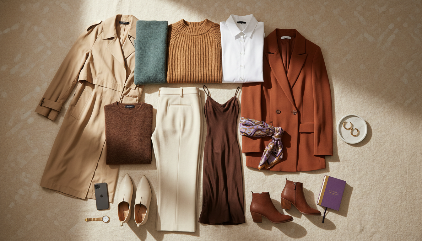
When a color fights your undertone, the simplest fix is physical distance from your face. Your complexion is most affected by the 20–30 centimeters closest to your features: collars, necklines, scarves, and lapels. If that zone is filled with hues that flatter you, you can get away with surprisingly tricky colors elsewhere. This is where I redirect your favorite “wrong” shades so they work with your wardrobe instead of against your skin.
Think of distance like dimming a harsh light. A muddy mustard next to your face may highlight under-eye shadows, but the same color as tailored pants, a belt, or a bag reads as intentional and rich. The key is to keep your upper third anchored in your best neutrals or friendly accent shades. That way, your eye reads harmony around your features first, and the challenging color becomes supporting detail, not the headline.
Use this simple placement checklist:
- Safe for wrong colors: pants, skirts, shoes, belts, bags, hats with a neutral brim edge.
- Use with caution: oversized cardigans or long vests that creep toward the neck.
- Usually risky: turtlenecks, crewnecks, and jackets with high lapels in off-palette shades.
When you move a difficult color lower or farther out, you extend the life of pieces you already own and reduce the urge to repurchase the same shade in multiple “almost right” versions. Less trial-and-error, fewer returns, and a wardrobe that still reflects what you love.

Moving a difficult color from your neckline to your lower half can soften its impact and make it more wearable.
The Shade Adjustment - Finding the right version of a color family
Most of the time, the issue is not the color family; it’s the version you’re choosing. You might say, “Red looks terrible on me,” but what you’ve really tested is a handful of bright, warm reds against cool skin. When I refine someone’s palette, I rarely eliminate a whole color. I shift temperature, depth, and softness until the color starts cooperating with their undertone and natural contrast.
Here’s a simple way to diagnose what needs to shift:
- Temperature: Cool undertones thrive with blue-based versions; warm undertones with yellow- or golden-based versions.
- Depth: Fair skin often prefers softer or mid-depth tones; deeper skin can carry rich, saturated versions easily.
- Clarity: If your coloring is delicate, slightly muted colors read more harmonious than sharp, neon brights.
Take coral as an example. On cool undertones, a neon, melon coral can make the skin look almost grey by comparison. A rosier, slightly softened coral with a hint of pink will lift your face instead of competing. On warm undertones, the opposite is true: a golden, apricot coral will echo the warmth in your skin and feel alive, while the cooler, pink-heavy coral can look flat.
Once you train your eye to spot these differences, shopping becomes faster and more precise. You stop buying “your color” in any version and start hunting for your temperature, depth, and clarity within that color, which dramatically reduces the number of near-miss pieces sitting unworn in your closet.

Small shifts in temperature and softness within the same color family can turn a “wrong” color into one that truly supports your skin.
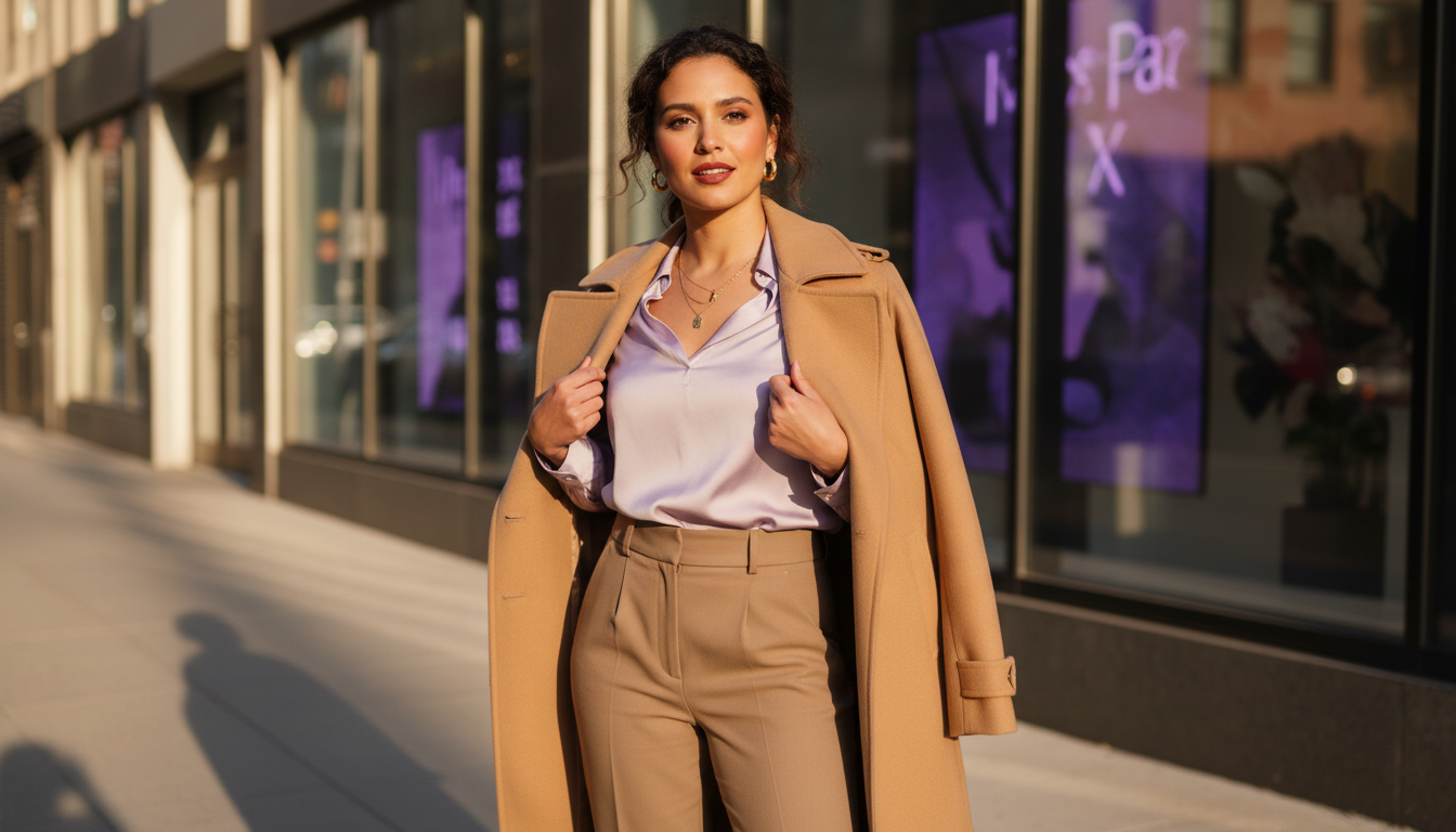
The Contrast Hack - Using accessories to bridge the gap
Sometimes you love a color enough that you want it near your face even if it’s technically wrong. In that case, I use what I call contrast bridging. The idea is to insert a buffer between your face and the difficult color using accessories in shades that love you. This tricks the eye into reading the overall combination as more flattering, even if the base garment on its own would wash you out.
You can create this bridge in a few ways:
- Neckline buffers: scarves, bandanas, or collared shirts layered under a sweater in your best neutrals.
- Jewelry focus: statement earrings or necklaces in flattering metals or stones that pull attention upward.
- Layering strategy: a blazer or overshirt in a good color partially covering the wrong-color top.
Imagine you’re wearing a cool, clear red that overwhelms your softer, neutral coloring. Adding a soft ivory silk scarf at the neckline immediately lightens the effect and brings a shade that loves you closer to your face. A lipstick that echoes your best red tones can also help, but I treat makeup as the final tweak, not the sole fix.
What I like about this hack is the ROI. With a few well-chosen accessories in your most flattering tones, you can rescue multiple questionable tops or dresses without replacing them. It’s a small, intentional upgrade that pays off across dozens of outfits and many rushed mornings in front of the mirror.

Neckline accessories in shades that love you can bridge the gap between your complexion and a challenging color.
If you want this level of clarity every morning and before every checkout, I can walk you through color decisions in real time so your wardrobe feels sharper within days, not months.
Turn outfit doubt into daily clarity
Upload a photo, and I’ll guide you through color choices in seconds so you get clear, confident, and out the door faster with a sharper wardrobe over time.
Strategic Placement - Pants, shoes, bags vs tops and jackets
Once you know how sensitive your face is to certain colors, placement becomes a quiet superpower. I think of your body in color zones: Face Zone (neckline, shoulders, near the jaw), Mid Zone (torso to mid-thigh), and Grounding Zone (anything below mid-thigh and accessories). Wrong colors are usually safest in the Grounding Zone, manageable in the Mid Zone, and harshest in the Face Zone. When you respect those zones, your outfits look more intentional with far less effort.
Here’s how I typically assign tricky colors:
- Pants and skirts: Ideal for your bold or slightly off-palette shades, especially when paired with a flattering neutral top.
- Shoes: Great for saturated or unusual colors you love but can’t wear near your face.
- Bags and belts: Perfect for testing a new color family before committing to clothing.
For tops and jackets, I keep you mostly within your best palette, or at least your best neutrals. If you’re determined to wear a challenging color in a blazer, I look for versions with plenty of visible lining or lapel contrast, or we rely heavily on the contrast hack with a good top underneath. The goal is that when someone looks at you, their eye lands on your face first, then on the outfit.
This approach saves money because you can buy that bright chartreuse or icy lilac as a shoe or bag instead of gambling on a full dress that might never leave your closet. You still get the personality and playfulness, but you’re not paying for pieces that photograph beautifully and live in your “someday” section.

Placing a tricky color in pants, accessories, or layered pieces lets you enjoy it without overpowering your features.
When to Let Go - Colors that truly don’t serve you
There are a few colors that fight you so hard that constant styling workarounds stop being worth it. My rule: if a shade needs distance, bridging, and heavy makeup to look acceptable, it’s not your ally. At that point, it drains time and energy every time you reach for it. Your wardrobe should be stocked with pieces that cooperate with you, not demand a full strategy just to feel okay.
You’ll know it’s time to let a color go when:
- You regularly change out of it at the last minute.
- You only wear it in heavily lit, highly styled situations (like nights out or photos) but never on a normal day.
- You find yourself buying different versions of it, hoping one will magically “work,” and none really do.
Releasing a color is not about limiting your style; it’s about simplifying your decisions. When you stop fighting for shades that drain you, you create space for colors that make you look awake, polished, and aligned with minimal effort. That’s where the real ROI is: fewer bad purchases, quicker morning choices, and a closet that quietly supports who you are.
I still want you to keep a playful, experimental edge. Keep one or two “just for fun” pieces in technically wrong colors if they bring you joy in specific contexts. But let your everyday palette be built around what loves you back, so most of your wardrobe works hard without needing complicated tricks every single time.
Turn outfit doubt into daily clarity
Upload a photo, and I’ll guide you through color choices in seconds so you get clear, confident, and out the door faster with a sharper wardrobe over time.