How to Build a Color Palette from Your Favorite Piece
The Reverse-Engineering Approach - Starting with what you love
I like to start color work in reverse: instead of asking, “What colors should I wear?” I ask, “What pieces do I already reach for without thinking?” Those favorites are data. They reveal the energy, saturation, and undertones you’re naturally drawn to, which is a far more honest starting point than a random Pinterest palette. So before you touch a color wheel, pull out one piece you truly love and wear often.
From there, I treat that item like a source file for your wardrobe. The goal is to build a palette around it so more of your closet works with less effort. That means fewer returns, fewer “nothing to wear” mornings, and less guesswork at checkout. With one strong anchor, you can translate its colors into:
- Neutrals that calm and support it
- Analogous tones that blend smoothly
- Complementary accents that add tension and interest
When you build your color system this way, you’re not forcing yourself into someone else’s aesthetic. You’re amplifying what already works on you and in your life. The rest of this guide walks through each step so you can repeat the process for any piece, from a floral dress to a graphic hoodie.
Step 1: Identify All Colors - Main, accent, undertones in the piece
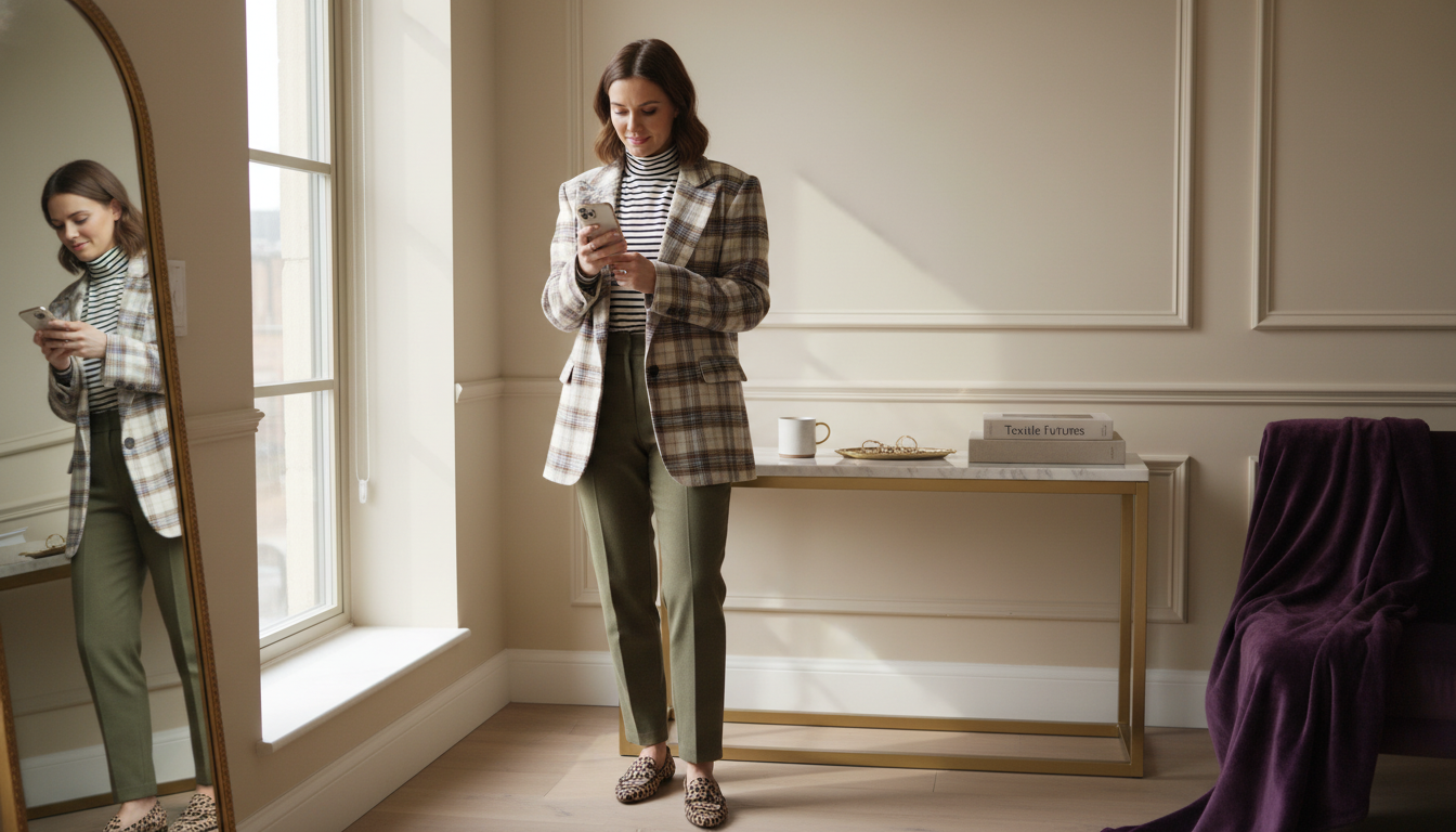
I start by reading the piece like a small landscape. Stand near a window, lay the item flat, and really look at it in daylight. Ask yourself: what is the dominant color my eye hits first? That becomes your anchor shade. Then notice the supporting players: smaller prints, stitching, buttons, or logos that quietly influence how the piece feels overall.
To keep it practical, I separate colors into three buckets:
- Main color: the field color or largest area
- Accent colors: stripes, motifs, trims, graphics
- Undertone family: warm (yellow/gold), cool (blue/rosy), or neutral
You don’t need perfect names like “dusty periwinkle.” Descriptors such as “muted cool blue” or “warm camel brown” are enough to steer good choices. If you struggle to see undertones, compare the piece to something obviously warm (like a true mustard) and obviously cool (like a clear cobalt). Which does it sit closer to? Once you’ve labeled your main, accent, and undertone, you have a clear reference point for every future color decision.

Read your favorite piece like a palette, then pull out the main, accent, and neutral tones you’ll build around.
Step 2: Pull Neutrals - Black, white, gray, nude, navy that complement
Next, I build a neutral backbone around that anchor piece. This is what actually makes your mornings faster, because neutrals are the pieces you’ll repeat constantly: trousers, outerwear, shoes, bags. Hold your item up against different neutrals you already own, again in daylight, and notice which ones sharpen it and which ones make it look flat or dingy.
I like to test a simple lineup:
- Soft white vs. crisp optic white
- Light gray vs. charcoal
- Navy vs. true black
- Warm beige/tan vs. cooler taupe
You’ll usually see a pattern. Warm pieces tend to glow against creamy whites, camel, and warm chocolate. Cool pieces feel cleaner with optical white, cool grays, and ink navy. Your goal is to pick two to three “workhorse” neutrals that consistently look intentional with the piece. Those become your default for big-ticket basics: coats, boots, tailoring. Choosing them now reduces random impulse buys later and keeps your wardrobe visually coherent.
Step 3: Find Analogous Colors - Colors next to it on color wheel
Once your neutrals are set, I expand outward with analogous colors: shades that sit next to your main color on the wheel. These are what create that soft, effortless coordination where nothing clashes, but nothing feels too matchy either. If your anchor is a muted blue, for example, your analogous range might include blue-green and blue-violet in similar softness.
You don’t need a physical wheel, but it helps to think in simple bands:
- If your piece is blue: look to blue-green and blue-violet
- If it’s green: look to yellow-green and blue-green
- If it’s red: explore red-orange and red-violet
Stay within the same temperature and intensity. A dusty sage pairs best with other muted, slightly gray-greens, not with neon lime. I like using analogous tones for shirts, knitwear, and softer pieces that sit close to the face. They give you variation without breaking the mood of your palette, which keeps packing, outfit planning, and online shopping much calmer.

Use the color wheel as quiet guidance, then translate it into real fabrics and pieces.
Step 4: Add Complementary Accents - Opposite colors for pop
After harmony, I look for tension. Complementary colors sit opposite your main color on the wheel and create that satisfying pop when used in the right dose. This is where bags, shoes, nails, or a single knit become powerful tools. You’re not building half your closet in these shades; you’re choosing one or two accents that wake up the palette.
Think in accents, not outfits:
- Blue anchors love a hint of warm rust, coral, or terracotta
- Olive or sage sing against soft lilac or dusty rose
- Burgundy looks elevated with a touch of teal or peacock
Keep the saturation and depth aligned. A deep navy pairs best with rich cognac or rust, not fluorescent orange. If you’re unsure, start with accessories around your face and hands where small color hits feel intentional rather than loud. This step is usually where outfits start to feel “styled” instead of just “matching,” without adding extra complexity to your morning routine.
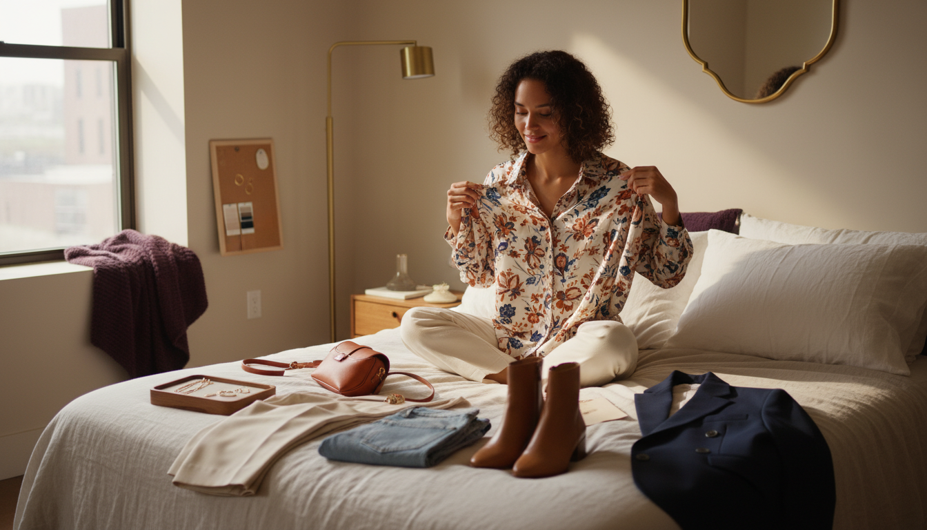
Step 5: Test Combinations - What works with your undertone
Now you have a theoretical palette; it’s time to see how it behaves on your actual body. I like to do a quick try-on session with a mirror near a window. Pair your anchor piece with each neutral, then with a couple of analogous and complementary options. Watch not just the clothes, but your skin, eyes, and overall presence.
Ask yourself:
- Does my face look brighter or more shadowed?
- Do I notice my features first, or the clothes?
- Does the outfit feel calm, energized, or muddy?
If a combination makes your skin look sallow, your dark circles more obvious, or your features disappear, that color is probably fighting your undertone. Favor the combinations where your face looks clear and awake with minimal effort. These become your “autopilot” pairings: the outfits you can grab in 30 seconds on a busy morning and trust to work. Over time, this filter saves you money by quietly eliminating colors that only look good on the hanger or on someone else’s feed.
If you want this level of clarity on your own wardrobe without spending a weekend color-coding your closet, I can translate one photo into a polished palette you can use tomorrow morning.
Turn one photo into your color system
Upload a favorite piece to Mira and I’ll build a clean, coordinating color palette for you in seconds, complete with shoppable ideas that fit your real life.
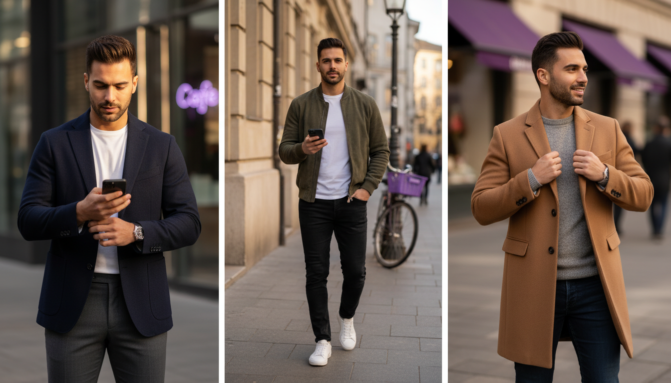
Step 6: Shop Strategically - Finding pieces in your new palette
Once your palette feels tested, you can finally let it guide your shopping. Instead of chasing every pretty color online, you’re asking one focused question: “Does this live in my palette?” That simple filter cuts down tabs, emotional cart adds, and return trips. I suggest saving your main color, chosen neutrals, analogous tones, and accents as a short note or album on your phone.
Then use that palette to steer decisions:
- Prioritize gaps in neutrals and everyday pieces first
- Add analogous tops or knits that work with multiple bottoms
- Reserve bold complementary shades mostly for accessories or occasional items
When browsing, compare product photos to your palette reference. If a color sits just outside but you love it, ask whether it supports or disrupts what you already own. If it clashes with your anchor piece and your tested neutrals, it’s likely to become a lonely item. Strategic shopping this way means each new piece clicks into multiple outfits, which is where you see real ROI: fewer unworn buys, more polished looks from a smaller wardrobe.

Shop with your palette in mind so every new piece coordinates with what you already own.
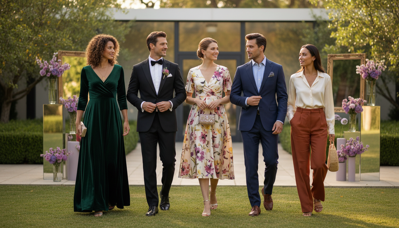
Real Examples - 3 favorite pieces + resulting color palettes
To make this concrete, I’ll walk through three different starting pieces and how their palettes unfold. Imagine first a soft, dusty blue oversized shirt you wear to death. Its main color is a muted cool blue with a cool undertone. The supporting palette might be: crisp white and soft gray as neutrals, blue-green and blue-violet as analogous tops or knits, and a touch of rust leather in shoes or a bag as the complementary accent.
Second, consider an olive utility jacket you throw over everything. Olive is a warm, muted yellow-green. It usually loves warm whites, camel, and chocolate as neutrals, deeper olives and mustard as analogous options, and a hint of soft lavender or lilac as a complementary accent in a scarf or knit. Suddenly your weekend uniform looks intentional instead of default.
Third, picture a burgundy slip skirt you save for “special” but actually love. Burgundy sits in the deep red-violet family. I’d build its palette with black or deep navy plus warm beige as neutrals, rose and blush as analogous tops, and a small injection of teal or peacock in earrings or a bag for contrast. Three pieces, three palettes, but the framework stays the same: identify, anchor, support, then accent. Once you see that pattern, you can reverse-engineer coordination from almost anything in your closet.

Different favorite pieces lead to different, equally intentional palettes when you apply the same framework.
Turn one photo into your color system
Upload a favorite piece to Mira and I’ll build a clean, coordinating color palette for you in seconds, complete with shoppable ideas that fit your real life.