The Art of Mixing Patterns: A Beginner's Guide
Why Pattern Mixing Works
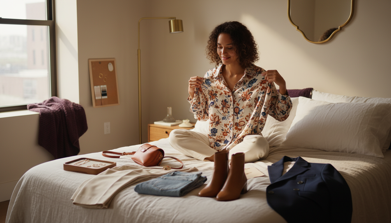
Pattern mixing works because it creates visual interest without relying on loud trends or constant new pieces. When you combine prints intentionally, your outfit feels layered and thought-through, even if every item is simple on its own. The eye moves across your look, catching details instead of getting stuck on one statement piece. That movement reads as sophistication, especially in photos or office lighting where flat outfits can look tired.
I see pattern mixing help busy clients in three specific ways: it stretches existing wardrobes, it reduces the urge to buy another “special” top, and it makes repeat outfits feel new. Once you understand a few principles, you can re-pair pieces you already own into fresh combinations. The key is shifting from “this feels risky” to “this follows a structure.” When you treat prints like building blocks instead of wildcards, you get more outfits, fewer returns, and faster mornings.
Think of it as upgrading from basic color-blocking to a more advanced version of the same idea. You’re still managing harmony, contrast, and balance; you’re just using lines, shapes, and motifs instead of only solid color. When you learn why certain combinations work, you’ll stop trying ten options and start trusting the first or second mix you build.
Rule 1: Vary the Scale
If you ignore everything else and only vary pattern scale, most pattern mixes will still look intentional. The issue I see most often is two prints that are almost the same size competing for attention. When dots and florals or checks and stripes share a similar scale, your eye doesn’t know where to land. That creates noise rather than rhythm. Changing the scale builds hierarchy and gives the outfit a clear focal point.
Here’s the framework I use:
- Choose one dominant large-scale pattern (big florals, bold stripes, oversized checks).
- Add one supporting small-scale pattern (pinstripes, micro-dots, tiny checks).
- Keep everything else either solid or very quiet, like a subtle texture.
If you add a third pattern, I like to treat it as a small accent: a belt, shoe, or bag with a mid-scale print that echoes either the color or mood of the main piece. This structure keeps the outfit legible in motion and in photos. It also shortens decision time, because you’re not asking, “Do these go together?” You’re asking, “Which piece is large, which is small, and what stays quiet?” That’s a question you can answer in seconds while getting ready or editing a cart.

Varying pattern scale creates hierarchy and calm; matching scales tend to compete for attention.
Rule 2: Share a Color
Shared color is what makes even bold combinations feel cohesive. When two or three patterns repeat the same shade, your brain reads them as belonging to the same story. Without that common thread, prints can feel random or costume-like. I often see great pieces fail together simply because there’s no repeated color to tie them in. Fixing that usually takes one swap, not a full outfit overhaul.
When you’re assessing patterns, look for:
- One dominant anchor color that appears in every pattern, even in small doses.
- A supporting color family (all cool tones, all warm neutrals, or a tight palette like navy, white, camel).
- Optional pop color that shows up in at least two places, like red in both a stripe and a floral.
If you’re new to this, limit yourself to two main colors plus a neutral. For example, navy and white prints grounded with tan shoes or a camel coat. This still looks layered but is almost impossible to clash. The benefit is practical: you’ll know at a glance which pieces in your closet talk to each other, and you’ll stop buying single-use prints that only work with one exact outfit.

When prints share a clear color story, they read as one cohesive look instead of separate statements.
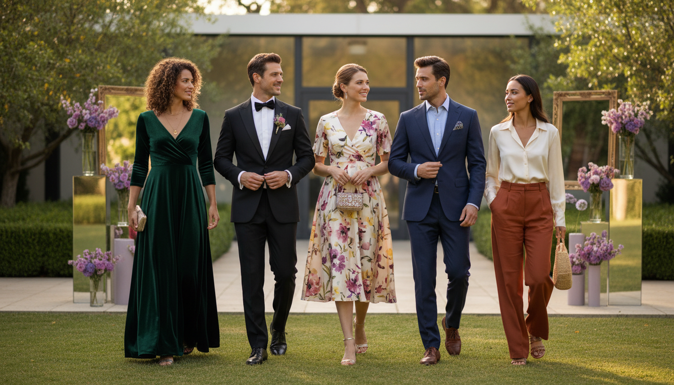
Rule 3: Mix Pattern Types
Mixing pattern types keeps outfits from looking too literal. Two florals together can feel overly sweet; two checks can lean preppy fast. When you cross categories, you create tension in a good way. The structure of a stripe next to the softness of a floral, or the playfulness of a dot against the order of a plaid, feels more modern. You’re essentially balancing different personalities in one look.
An easy way to think about this is to pair linear patterns with organic ones:
- Stripes + florals
- Plaids/checks + abstract or brushstroke prints
- Geometric prints (like diamonds) + animal or irregular dots
I like to let one pattern carry the attitude, and the other provide structure. For example, a sharp pinstripe blazer over a relaxed ditsy-floral dress feels grounded but not stiff. Or a clean windowpane trouser with a subtle animal-print shoe keeps the personality close to the floor, where it’s less overwhelming. Once you start seeing patterns in families rather than as one-offs, it becomes much faster to decide what pairs well and what starts fighting for attention.

Seeing stripes, florals, plaids, dots, and geometrics together makes it easier to recognize how different pattern families can mix.
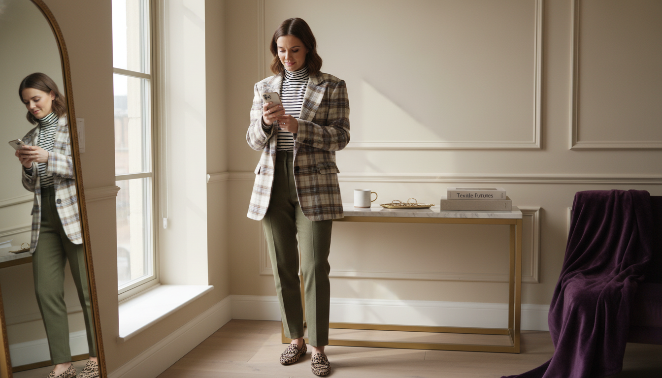
Rule 4: Use Neutrals as Bridges
Neutrals are your buffer between busy prints. When people tell me, “Pattern mixing looks great on others but chaotic on me,” they’re often missing solid, quiet pieces in between. A neutral tee, blazer, or pair of trousers gives the eye a place to rest. It also physically separates prints so they speak to each other instead of overlapping into visual static. This is what keeps real-life outfits wearable from subway to office to dinner.
I like to think of neutrals as bridge pieces. They connect two patterns that share a color but might feel too intense when touching. For example, a striped tee, solid cream trousers, and floral coat: the stripes and florals share navy, but the cream pants keep them from shouting over each other. You can apply the same idea with a solid belt between a printed top and skirt, or neutral sneakers under patterned pants.
Neutrals also make your wardrobe more efficient. Investing in a few well-cut solid basics in bone, black, navy, or camel means every new print has multiple ways to slot in. That reduces returns because you’re not stuck chasing one “perfect” coordinating piece; your bridges already exist. In the morning, this turns into a simple algorithm instead of a styling puzzle: print, neutral, print, and you’re done.
Safe Combinations
Some pattern mixes are so reliable I treat them as “house recipes.” They work across styles, ages, and seasons with minimal tweaking. If you want to build confidence without overthinking, start here. These are the pairings I see work repeatedly in real wardrobes and on camera.
My favorite safe combinations:
- Stripes + anything: Breton stripes with florals, animal print, plaid, or dots. The regular rhythm of a stripe behaves almost like a neutral.
- Geometric + organic: Checks or grids with painterly prints, marbling, or leaf motifs. The contrast in structure keeps it intentional.
- Micro-print + bold print: Tiny polka dots with a large floral, or mini houndstooth with big plaid.
If you stay within a tight color palette while using these formulas, your risk goes down further. For example, black-and-white stripes with a black-and-white floral skirt, grounded by black boots. The outfit looks designed, not experimental, and you can recreate the same logic with pieces you already own. Over time, these “safe” combinations become muscle memory, shaving minutes off your morning routine and giving you a default when your brain is tired.
Advanced Combinations
Three patterns in one outfit look elevated when handled with structure. Without that structure, it can slip into maximalism you might not actually want to wear to work or brunch. When I build a three-pattern look, I assign each print a role: lead, support, and accent. That hierarchy keeps the mix from feeling like three separate ideas. It also ensures the outfit still photographs cleanly for social or LinkedIn.
Here’s a reliable three-pattern framework:
- Lead pattern (largest scale): Often on the biggest surface, like a dress, skirt, or trousers.
- Supporting pattern (small scale): A shirt, knit, or scarf that repeats at least one color from the lead piece.
- Accent pattern (mid or small scale): Shoes, bag, or hair accessory that echoes either the color or pattern type.
For instance, imagine a large plaid trouser (lead), a fine striped shirt (support), and subtle animal-print flats (accent), all sharing black or camel. The result feels curated, not loud, because the eye understands the order of importance. This level of mixing dramatically increases outfit options, especially for creators or professionals who appear on camera often. Once you trust this framework, you can dress more expressively without needing a completely new wardrobe.
Common Mistakes
Most “bad” pattern mixes aren’t about taste; they’re about missing structure. I consistently see three issues: too much contrast, clashing scales, and no unifying element. When contrast is extreme in both color and pattern type, the outfit feels like competing headlines. High-contrast colors plus high-contrast prints are rarely needed for daily life. They also tend to look harsher in photos and harsh office lighting.
Typical pattern-mixing mistakes:
- Same-scale prints touching: Medium florals with medium checks side-by-side, with no solid in between.
- No shared color: Two or three strong prints in completely different palettes.
- Pattern overload without rest: Printed top, bottom, and outerwear with no neutral bridge.
When you run into any of these, fix it by removing one variable at a time. Either soften the color contrast (e.g., swap a black print for navy), change the scale, or insert a solid piece between prints. This approach saves time in the morning because you’re editing with intention instead of starting over. It also means fewer “panic purchases” to fix an outfit, since you’ll know when the problem is the pairing, not your entire wardrobe.
If you want your pattern choices to feel intentional every morning instead of experimental, I can shorten that learning curve from months of trial-and-error to a single focused session.
Get Confident With Pattern Mixing, Fast
Upload a few outfits to Mira and get tailored pattern-mixing feedback in seconds so your looks feel intentional, polished, and easy to repeat.
Outfit Formulas
To make this actionable, I want you to leave with plug-and-play formulas you can test this week. Each one uses the rules we covered: varied scale, shared color, mixed pattern types, and neutral bridges. You can adapt them to your climate, dress code, or style, but keep the structure the same. Once you see these work on your own body, you’ll trust your eye more and spend less time second-guessing.
Five foolproof pattern-mixing combinations:
- Breton stripe tee + floral midi skirt + neutral sneaker: Stripes act as a calm foil to the floral; white or cream in both anchors the look.
- Micro-check blazer + solid tee + wide-leg printed trouser: Check is small-scale support, trouser print leads, tee bridges.
- Printed wrap dress + fine striped turtleneck layered underneath: Tiny stripe adds depth without competing; shared color keeps it cohesive.
- Plaid trouser + polka-dot blouse + solid belt: Dots are small and playful against grounded plaid; belt creates needed separation.
- Animal-print shoe + pinstripe pant + solid top: Pattern interest stays low and subtle while stripes lengthen the leg.
Use these as templates when you’re shopping or building outfits. If a new piece doesn’t slot into at least two of these formulas with items you own, it’s likely to become a high-risk buy. That single filter alone reduces returns and makes your wardrobe feel more curated, without adding extra complexity to your mornings.

Treat pattern-mixing outfits like reliable recipes—once you know a few, you can repeat them effortlessly with different pieces.
Get Confident With Pattern Mixing, Fast
Upload a few outfits to Mira and get tailored pattern-mixing feedback in seconds so your looks feel intentional, polished, and easy to repeat.