How to Find Your Skin's Undertone in 3 Simple Tests
Introduction - Why undertone matters more than skin color (affects every clothing choice)
When someone tells me, “I can’t wear color; it never looks right on me,” I almost always find the real issue is undertone, not skin color. Two people can be the same depth of skin tone and look completely different in the same shade because the temperature of their skin is different. Undertone is that temperature: warm, cool, or neutral. It sits underneath your surface tone and it doesn’t change as dramatically with seasons or tanning. Once you decode it, every color choice becomes faster and more reliable.
For busy mornings and quick online orders, this matters more than any trend. If your undertone is cool, icy pinks and blue-based reds will make your skin look clear and awake; if you’re warm, those same shades can read harsh while earthy tones make you glow. When you understand your undertone, you stop debating every color in your cart and start filtering instantly. That means fewer returns, less “this looks weird on me” moments, and a closet where most pieces actually cooperate with each other. In this series, I’ll walk you through simple tests you can do at home so you can stop guessing and start choosing with precision.
The Vein Test - Wrist vein color method with step-by-step photos
The vein test is where I like to start because it’s quick and works with what you already have: your wrist and good light. Hold your inner wrist up in clear, natural daylight and study the veins you see most clearly. If they appear more blue or purple, that usually points to a cool undertone. If they look more green or olive, that usually indicates a warm undertone. If you genuinely see both or can’t tell, you may lean neutral.
To make this as accurate as possible, treat it like a mini experiment instead of a two-second glance. I recommend:
- Stand near a window in indirect sunlight, not under yellow lamps.
- Look at both wrists; sometimes one side is easier to read.
- If you wear self-tanner, check an area with less product, like near the elbow.
The payoff is time: once you read your veins correctly, you have a baseline for every other test. You also start to notice why some colors feel natural on you while others always need “extra makeup” to work. The vein test isn’t perfect on its own, especially for deeper skin or visible redness, which is why I always pair it with the jewelry and paper tests for a more confident result.

Check your veins in natural light from a few angles to read blue, purple, or green tones accurately.
The Jewelry Test - Gold vs silver comparison with visual examples
The jewelry test answers a simple question: does your skin look more alive in gold or in silver? I like this test because it mimics real life; you’re often choosing between metal tones when you get dressed or shop online. To run it properly, take one simple gold piece and one simple silver piece, ideally similar in size and style. Stud earrings, thin hoops, or a clean chain work well. Avoid mixed metals or heavy textures that distract from the color of the metal.
Stand in natural light, tie your hair back if it competes, and test one metal at a time against your face. Ask yourself:
- With silver, does your skin look clearer and your eye whites brighter?
- With yellow gold, does your face look warmer and more even?
- Does one option make shadows, redness, or under-eye circles look harsher?
If silver consistently flatters you more, you’re likely cool-toned. If yellow gold is softer and more harmonious, you likely lean warm. If both look equally good, especially in softer, muted versions, you may be neutral. Once you know your metal match, you can streamline purchases: jewelry, hardware on bags, belt buckles, even eyeglass frames start to fall into a clear “yes” or “skip” pattern.

Compare simple gold and silver pieces against your face to see which metal makes your skin look clearer and more alive.
The White Paper Test - How your skin reacts to pure white vs off-white
The white paper test shows you how your skin reacts to different temperatures of “white,” which translates directly into clothing basics. Take a sheet of bright printer paper and a creamy off-white object, like an ivory T-shirt or beige notebook. Stand in indirect daylight with a clean face, no heavy foundation that neutralizes your natural color. Hold the white paper beside your lower cheek or neck and really observe what happens to your skin next to that bright, cool white.
Then swap to the off-white item and compare. To read the results clearly, notice:
- With pure white, does your skin look crisp and clear, or sallow and tired?
- With ivory or cream, does your face warm up pleasantly, or turn dull and yellowish?
- Which version makes your features look more defined without extra makeup?
If pure, bright white lights you up, you likely lean cool. If soft ivory and warm off-whites feel more natural and less stark, that suggests a warm undertone. If both are fine but you prefer slightly muted, you may be neutral or softly warm. This test helps you make faster decisions about T-shirts, sneakers, button-downs, and wedding guest dresses, where “white-ish” options can be overwhelming online. Instead of guessing, you’ll know whether to filter for optic white or warm cream.
Common Mistakes - Confusing surface tone with undertone, seasonal tanning effects
A lot of people get stuck because they confuse surface tone with undertone. Surface tone is what you see in the mirror today: fair, medium, deep, tanned, flushed, or a bit uneven. That part can shift with sun, skincare, or sleep. Undertone sits underneath all of that and usually stays stable over time. So if you get more golden in the summer, it doesn’t mean your cool or neutral undertone turned warm overnight.
Here are the mistakes I see most often:
- Matching foundation shade to undertone tests and assuming your clothes must match that exact color.
- Doing tests under yellow bathroom lights or harsh overhead lighting.
- Testing right after a workout, when your skin is very red or warm.
Tanning can distract you, especially if you’re naturally cool but pick up a golden surface color in the sun. In that case, your best clothing colors still follow your original undertone; they just might look richer against your summer depth. When you separate “this is my current shade” from “this is my lifelong undertone,” you stop reinventing your wardrobe every season and start building a consistent color strategy that works year-round.

The right undertone-friendly color softens shadows and brings your face forward; the wrong one can make you look tired, even if the outfit is stylish.
What This Means for Your Wardrobe - Quick color direction based on results
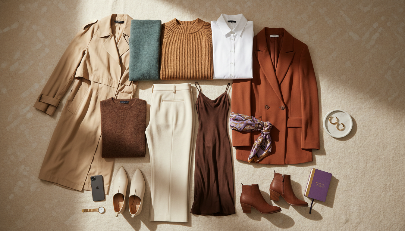
Once you know your undertone, color choices stop feeling like a gamble and start feeling like a filter. If your tests point to a cool undertone, prioritize blue-based colors: jewel tones like emerald, sapphire, and amethyst; true reds with a hint of blue; icy pinks; charcoal and crisp white. These shades tend to make your skin look smoother and more awake. For warm undertones, lean into earthy and sunlit tones: terracotta, mustard, olive, warm beige, camel, and corals with a touch of orange. They harmonize with the warmth in your skin instead of fighting it.
If you’re neutral, you have range, but you’ll usually look best in softened, less extreme versions of both families. Think dusty rose instead of neon pink, soft teal instead of electric blue, warm greige over stark black and white. To turn this into a practical system, use your undertone as a “yes/no” filter at three moments:
- When building your basics: tees, knits, outerwear, and shoes.
- When adding statement pieces so they don’t just photograph well, but suit you.
- When doing cart checks to cut obvious color mismatches before you buy.
This alone can reduce returns and morning outfit changes because most pieces will naturally coordinate. Instead of wondering why something feels off, you’ll recognize, “This red is too orange for my cool skin,” and redirect your energy toward pieces that actually earn their place in your closet.

Use warm, cool, and neutral color families as a filter once you know which undertone group you belong to.
Once you understand your undertone, the next step is translating it into everyday shopping decisions and outfits without adding more tabs or guesswork.
Want personalized color recommendations for your exact undertone?
Mira analyzes your skin tone from a selfie and recommends colors that make you glow—no guesswork, just results.
Want personalized color recommendations for your exact undertone?
Mira analyzes your skin tone from a selfie and recommends colors that make you glow—no guesswork, just results.